
Introduction
Today, people make fast, sharp, and data-driven decisions as far as possible. Yet even the most important data might fall flat if it’s not presented well. Reporting does not need to be the kind of lazy, default visuals where a pie chart is used and generic tables are fashioned without considering whether they are indeed the best fit for the data or the story.
This blog fills that gap: helping you with the best type of visualization appropriate for your data, whether you build reports within Oracle BI, OTBI, Oracle Analytics Cloud, or Power BI. You will know by the by-the-what, when, and why of using that representation.
Why Do We Visualize Data
The human eye was never designed to study rows of numbers; it’s built to identify patterns, spot anomalies, store visual information in long-term memory, and react to attention-grabbing signals.
Visualizations bridge the gap between raw data and human perception, turning complexity into clarity. This is why a well-designed chart can tell a story briefly, while a spreadsheet forces the mind to slow down and decode.
The Data-to-Ink Ratio Principle
A good visualization follows the data-to-ink ratio principle—using the minimum amount of visual decoration necessary to convey meaning.
- Data Ink—Elements that directly represent the data (bars, points, and lines).
- Non-Data Ink—Backgrounds, borders, shading, or decorative elements that don’t convey data.
Too much non-data ink, like unnecessary colors, gradients, or 3D effects, distracts from the story. Less decoration and more simplicity and clarity will always make your dashboard more effective.
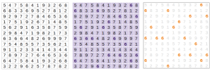
For example, the first two visuals below clutter the view with excessive non-data ink, making it harder to focus on the actual information. The third visual removes unnecessary decoration, keeping only the essential data ink elements. This demonstrates how simplicity and clarity enhance understanding, making the message more effective.
Why Choose Visuals Wisely
The right visual can transform a raw dataset into a clear, actionable insight.
The wrong one can hide patterns, confuse stakeholders, and even lead to poor decisions.
Why it matters:
- Clarity—A good visual makes insights obvious at first glance.
- Focus—The right visual highlights what matters most.
- Engagement—Well-chosen visuals keep audiences interested and informed.
- Accuracy—Some visuals distort data if used incorrectly (e.g., 3D pie charts).
Example: In Power BI, a bar chart showing sales by product makes category comparisons instantly clear, while the same data in a pie chart would make it harder to compare close values.
Answer these questions before choosing a visual:
Before choosing a chart for your descriptive representation, consider the following:
1. What is the key message or question I want to answer?
2. Who is the audience: technical users or business stakeholders?
3. Will the focus be on trends, comparisons, or proportions?
4. Would interactivity be required (filters, drilldowns)?
5. What is the requirement for detail at first glance?
Such answers will enable you to eliminate visuals that are either too complex or too simple for your case.
Best Visuals Per Data Type
- Comparing Categories
Best visuals: Bar chart, Column chart
- When to use: Comparing quantities across categories
- Horizontal vs. Vertical Significance:
Bar Chart (Horizontal)—Better for long category labels or when comparing many items side by side, as the text is easier to read horizontally.
Column Chart (Vertical)—Works well when showing time-based categories or when there are fewer, short-named categories
- Example: Headcount by department in OTBI works perfectly with a bar chart easy to read and compare lengths. In Power BI, column charts are great for side-by-side metric comparisons.
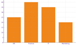
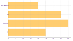
i. Column Chart ii. Bar Chart
- Tracking Trends Over Time
Best visuals: Line chart, Line & Clustered Column Chart
- When to use: Showing change or patterns over a timeline
- Example: In OAC, a line chart showing the number of requisitions approved on each day. A line & clustered column chart can highlight if the monthly performance is improving as per requisitions.
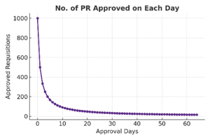
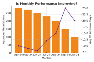
i. Line Chart ii. Line & Clustered Column Chart
- Showing Percentages or Part-to-Whole
Best visuals: Donut chart, Pie Chart, 100% stacked bar
- When to use: Displaying proportions without overwhelming detail
- Example: Power BI’s donut chart and Pie Chart can show gender distribution in a team, while a stacked bar compares percentage contribution of each region to total revenue.
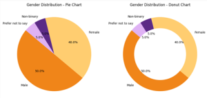
Note: Pie charts aren’t great if you want to differentiate between minor percentage differences, but can help quickly show big differences.
- Progress Against a Goal
Best visuals: Gauge chart
- When to use: Displaying performance vs. a target
- Example: In OAC, a gauge chart is ideal for tracking Revenue target completion against the target amount.
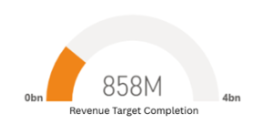
i. Gauge Chart
- Understanding Relationships or Correlations
Best visuals: Scatter plot, Bubble chart
- When to use: Showing how two or more variables relate
- Example: A scatter plot in Power BI (Showing Number of Invoice Vs Amount as Per Source) can reveal patterns, clusters, and outliers in billing behaviour across different sources, helping identify high-volume/high-value sources or unusual transactions. Bubble Chart can add a third dimension — for example, bubble size could represent total customers, average invoice value, or profit margin for each source.
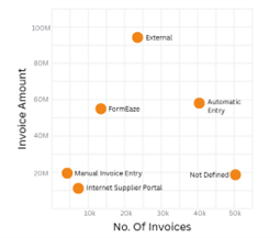
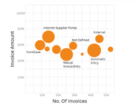
i. Scatter Plot ii. Bubble Chart
- Hierarchy Visualization
Best visuals: Treemap, Cardinality Graph
- When to use: Displaying data with multiple levels of categorization, Showing counts or frequency of each distinct category in a field
- Example: Power BI’s treemap can show Region → Branch → Team sizes, making it easy to drill down visually and Using Cardinality Graph to Visualize Gender distribution across teams
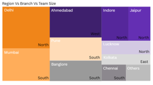
i. Treemap
- Geographic Data
Best visuals: Geo map, Heatmap
- When to use: Showing location-based metrics
- Example: Geo Map can display sales by state, while Power BI’s heatmap layers colour intensity to show concentration.
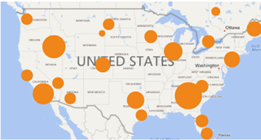

i. Geo Map ii. Heat Map
Why Appropriate Visuals Work
1. Towards Recognition of Patterns: Humans are much faster in pattern recognition in visuals than in tables.
2 . Time of Judgment: Clean visuals reduce the amount of time for any type of analysis.
3. Error Reduction: Misunderstanding complex numbers is avoided.
4 .Retention: The mind tends to remember visual stories better than mere data.
Conclusion: Your Quick Visual Selection Table
| Data Goal | Best Visuals | Example | Recommended Tool |
| Compare categories | Bar, Column | Headcount by department | OTBI / Power BI |
| Trends over time | Line, Area | Monthly attrition rate | OAC / Power BI |
| Percentages | Donut, Pie, Stacked Bar | Gender split in hiring | Power BI / OTBI |
| Progress to goal | Gauge, Bullet | Training completion % | OAC / Power BI |
| Relationships | Scatter, Bubble | Tenure vs performance | Power BI |
| Hierarchy | TreeMap | Region → Branch → Team | Power BI |
| Geographic data | Geo Map, Heatmap | Sales by state | OTBI / Power BI |
You’ll have to ask the right questions, understand the data type, and take advantage of the strengths of tools such as Oracle BI, OTBI, or even OAC or Power BI to create dashboards that don’t just look good but also drive decisions.